
You. physio & Therapy
Logo & Branding collateral RE - Design


HOW DO I THINK?
Take a peak into my mind…
-
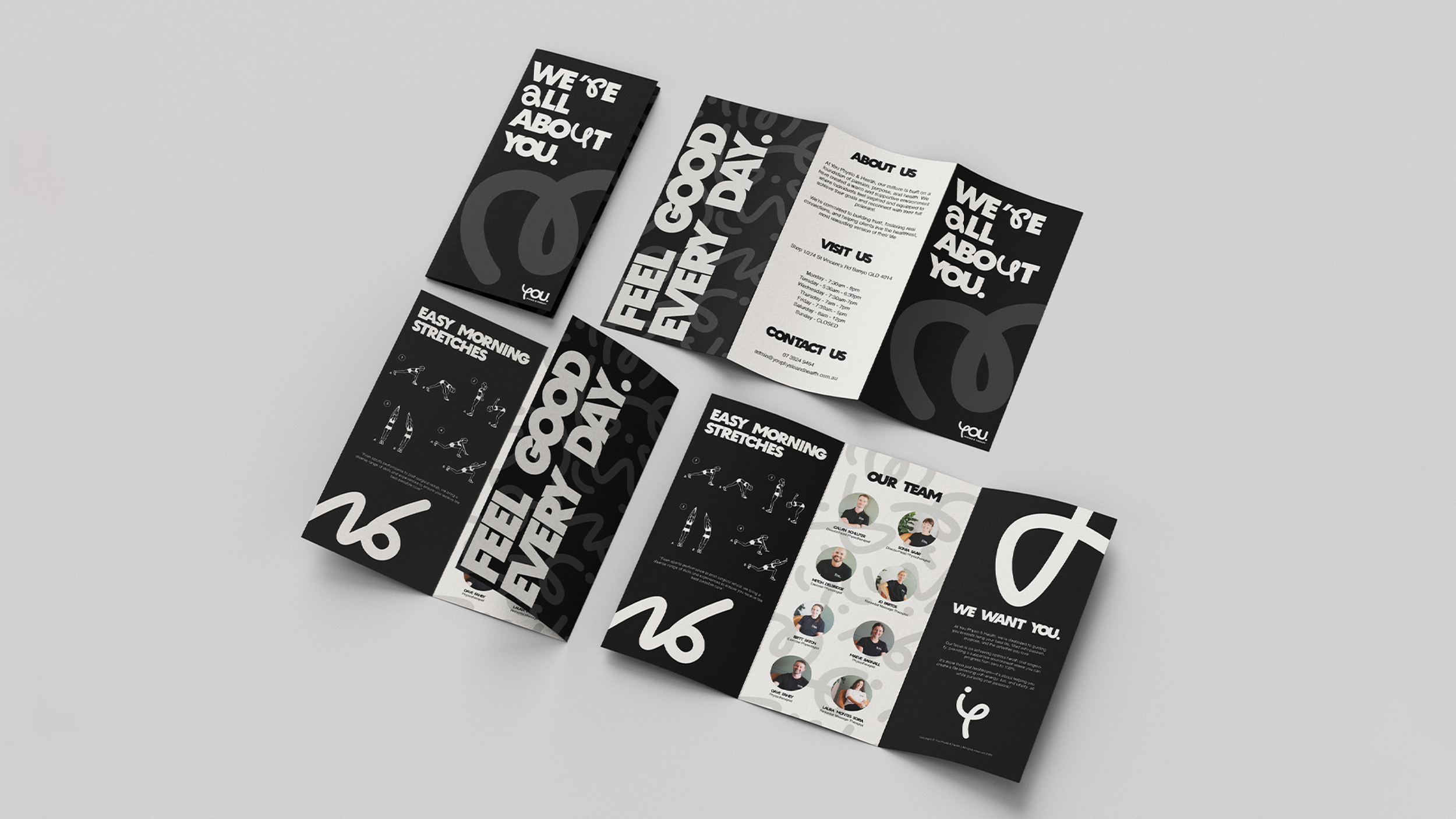
For this hypothetical project, I was tasked with researching a current small business within my local area and re-branding it in a way that could allow it to grow into a large multi-platform business. The client would need multiple touchpoints to gain traction through different areas of marketing, as well as a strong timeless brand voice that didn’t stray too far from the current design attitude.
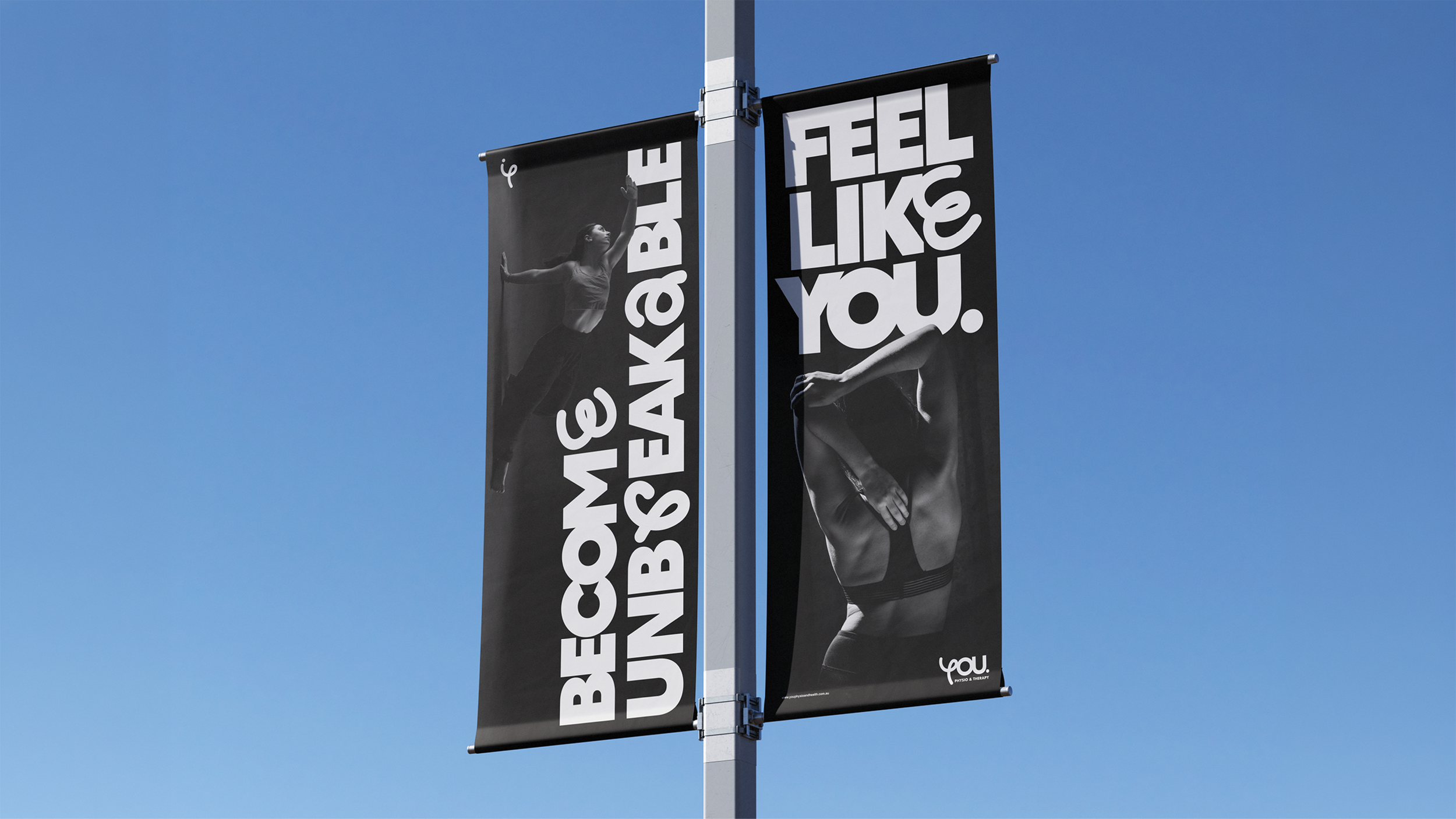
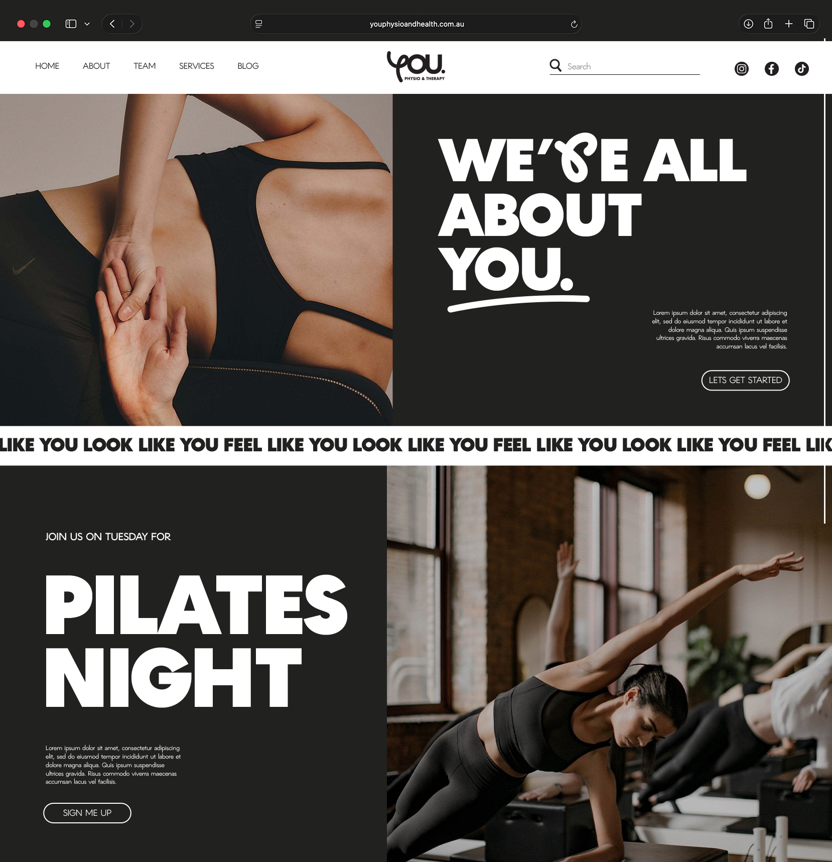
When researching I found this company called YOU. Health and Fitness. They were the perfect candidates as they are already knew what their brand was, they just needed a stronger branding guideline and logo representation to grow from their small business. Although in a small geographical area, their physiotherapy services were used by many and needed to have marketing to adapt to their loving, upbeat, welcoming style.
-
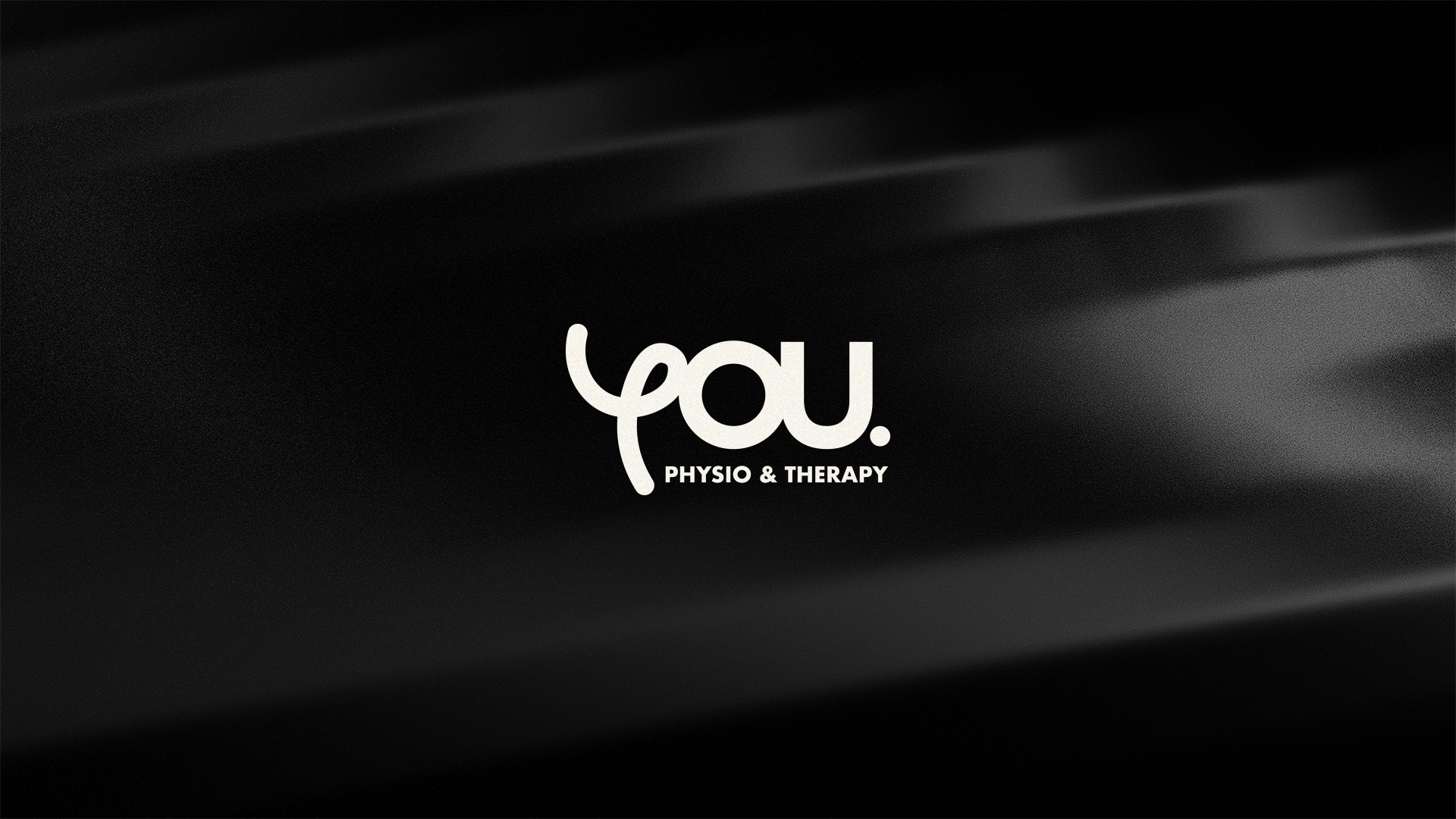
The previous logo consisted of a brand mark with serif typography. This was difficult to read from afar, jarring with its sharp edges and didn’t portray their friendly demeanor. As such I approached the logo design process by stripping it back to the roots. The key word that would be the base was ‘Movement’.
Movement needed to be represented through the logo, marketing, people and all other forms of communication. It would apply to the movement of the individual, but also the movement of the community. This singular word allowed for an incredible logo design that based itself on the movement of the individual, whilst representing the movement of the whole.
-
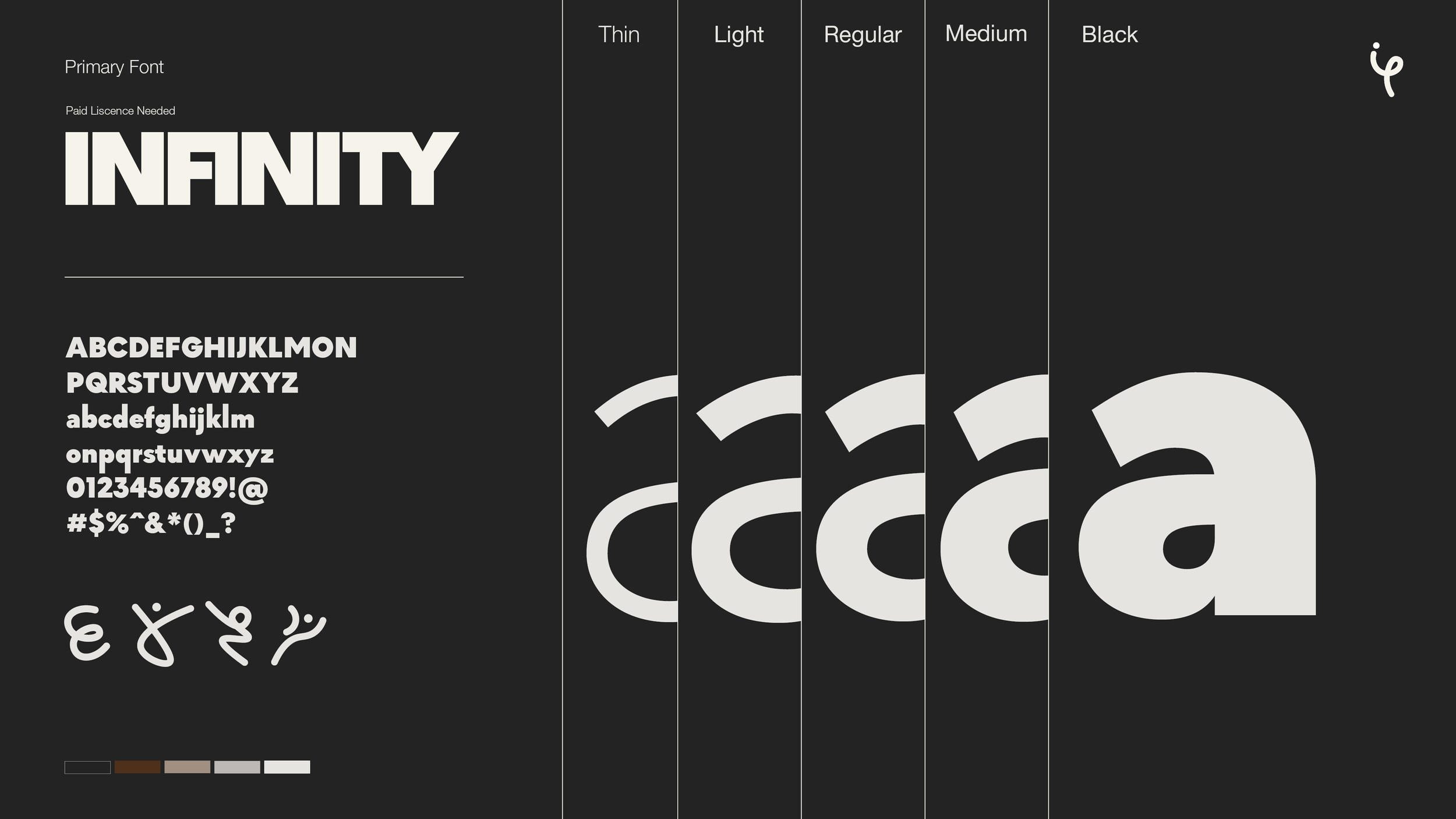
The final design portrays a minimalistic design that emulates the shape of the letter ‘Y’, whilst also interpreting the flow of a yoga pose. This design succeeds in developing the original brand mark from words into an adaptable symbol. The new logo is not only timeless but allows for the future creation of iconography. By using the flowing lines and dots, many forms can be created for all the different touchpoints needed current and future.
The new logo also succeeds in forming a soft, welcoming feeling. The previous serif wordmark was sharp and clinical, where the new flowing symbols allows for calmness as some patience entering the clinic may be nervous or scared. Succeeding in adapting itself for the wellbeing of their customers.
Messy Beginnings make good designs!


