Molten Beans
Packaging and Branding Design


HOW DO I THINK?
Take a peak into my mind…
-
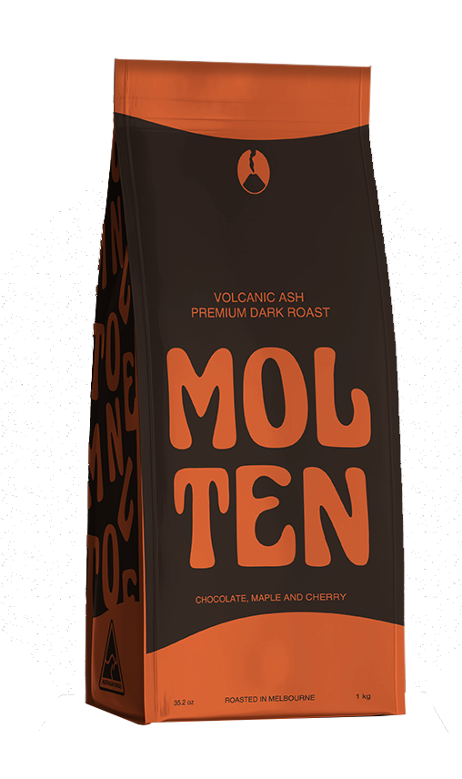
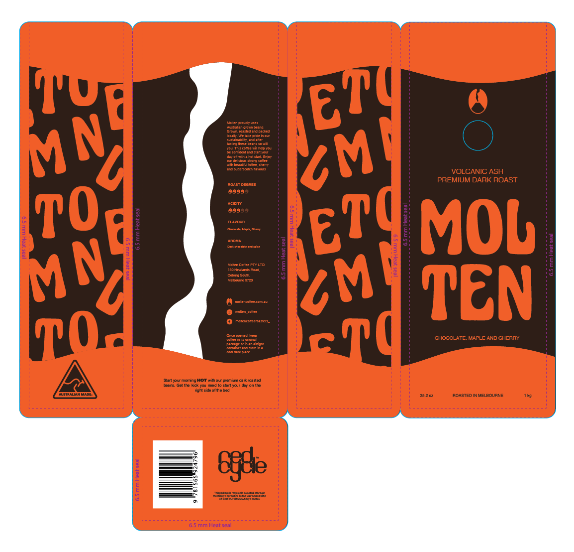
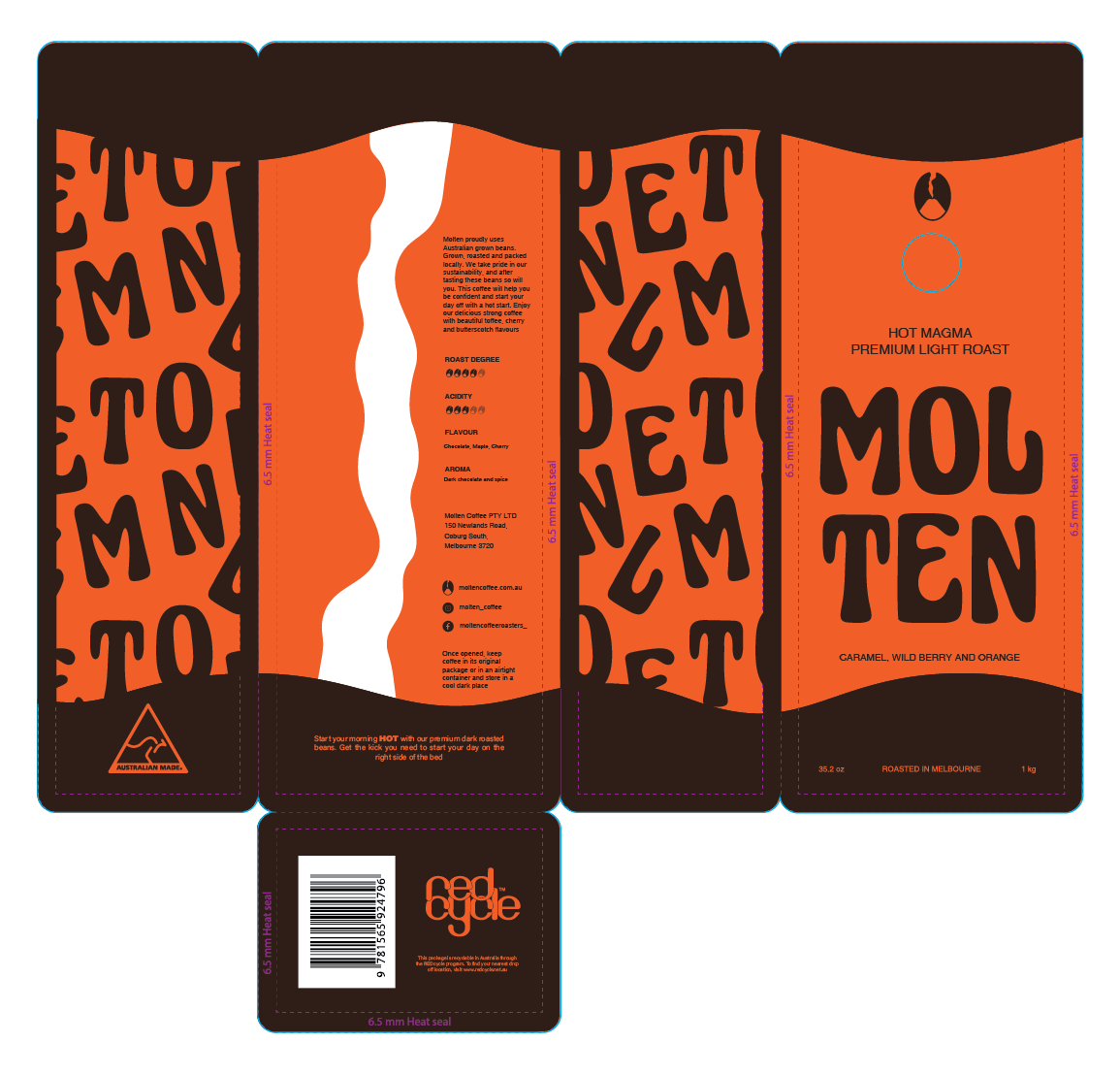
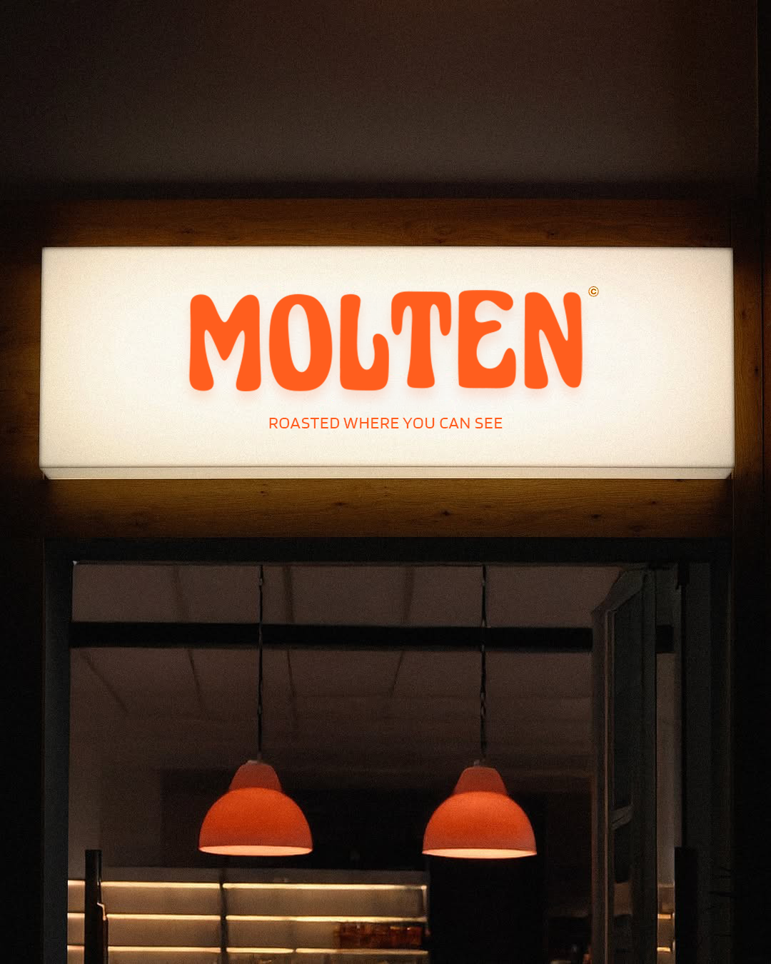
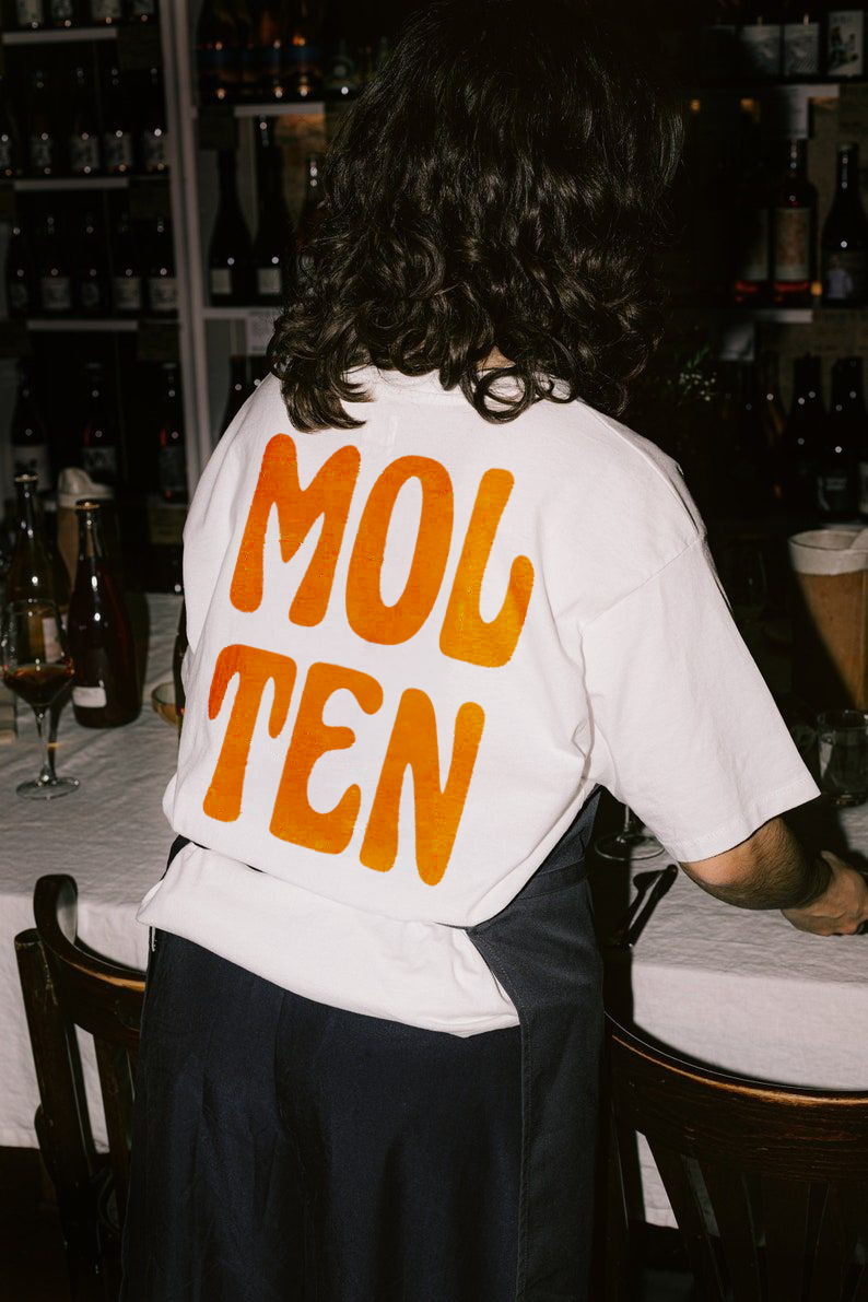
A strong branding voice is an extremely important aspect of any business. For this project, I was tasked with creating a coffee company that had a clear brand voice that stood out amongst its competitors. The client needed a name and a logo that would be able to adapt with the rising social media personalities. Coffee as a product is now becoming an influencer itself through online platforms, and ‘MOLTEN’ would be the company that stands out.
-
When ideating the name for the brand, I searched for a word that could allow for multiple interpretations and understandings. Beginning at ‘Dunes’, I made my way eventually to ‘Molten’. This could not only mean heat, but also texture, location, roast type and many others. Allowing for a company that was not named literally but named through personality and intention.
The end goal for this logo and brand voice was to form a coffee for the upcoming youth and young adults. A company that knew how to have fun, felt personal and in touch with its surroundings. This is the basis on which all the Molten branding was created.
-
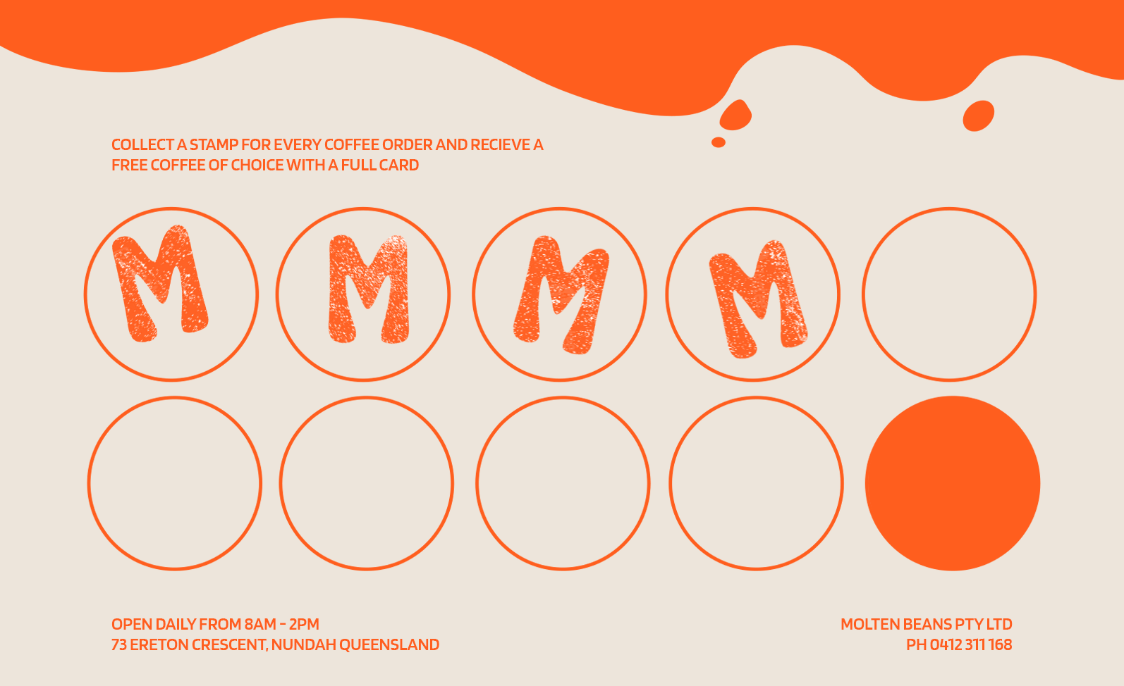
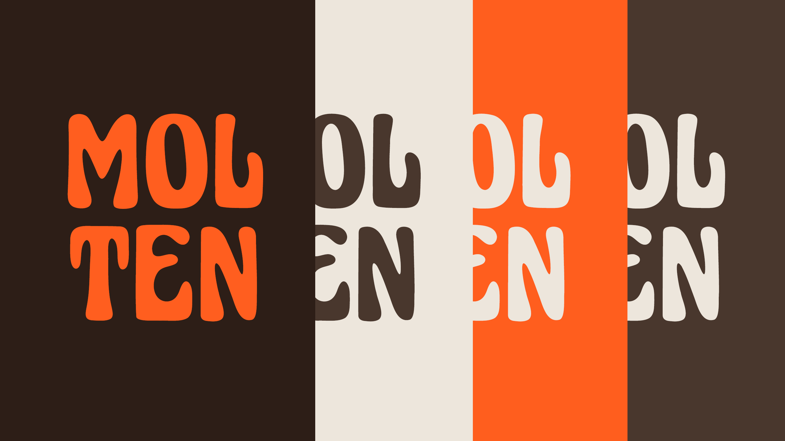
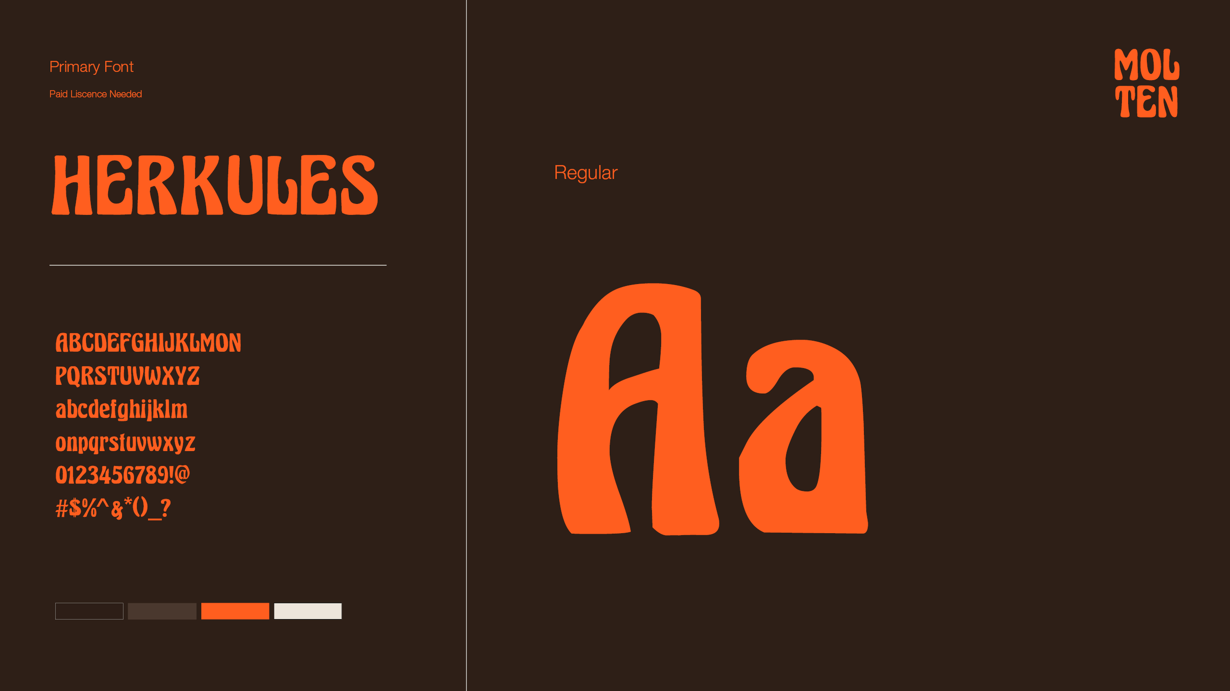
The outcome shows a logo mark that uses typography as its base. To allow for the word molten to be interpretive, it felt best not to put an image with it. Allowing the intuition of the audience to design a logo in their own heads that best suited them. This allows for Molten to feel personal whilst catering for the majority. The bright orange stands out and feels youthful in comparison to the neutral tones of other brands. The company feels minimal, calming and understanding of who they are as well as their audience. Forming a trusting bond between producer and consumer. Overall, I believe this brand voice completes the tasks it needs to and will have the ability to remain relevant and timeless.